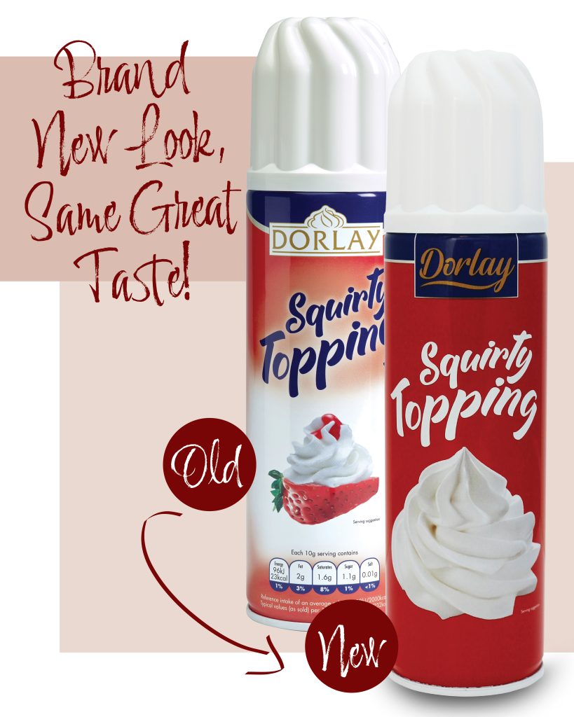
Dorlay’s classic Squirty Topping just got a fresh coat of paint — and it’s looking bolder than ever.
You might recognise the name, but the new red can design makes this favourite feel brand new. We’ve moved from the soft gradients and traditional dessert visuals of our old packaging to a sleek, more modern aesthetic. The update brings sharper impact on shelf, greater brand consistency across ranges, and a clean, confident statement that reflects the quality inside.
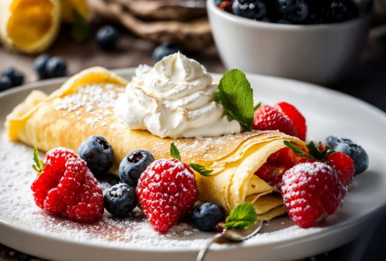
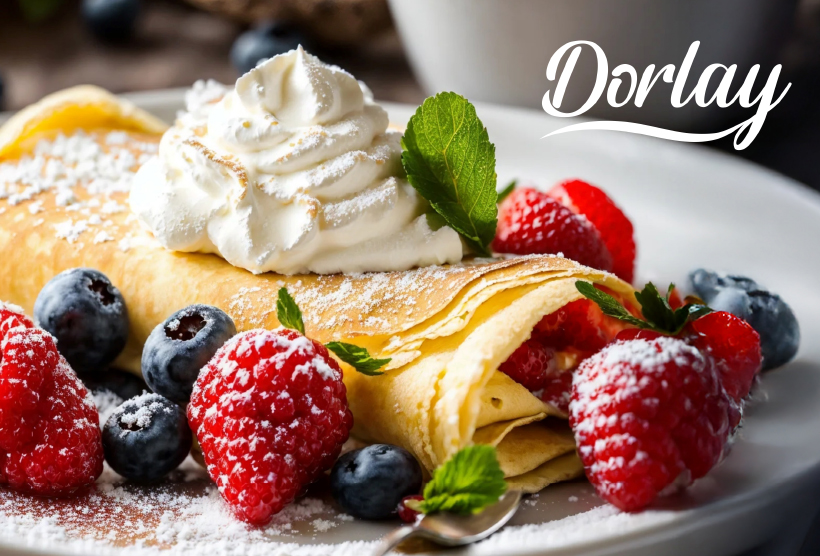
Whether it’s crowned on coffee, heaped onto desserts, or paired with pancakes, Dorlay’s Squirty Topping has long been a staple for cafés, caterers, and retailers across the UK. The new design keeps everything you love — same product, same formula — just now in packaging that pops.
Why the refresh?
Because consumer trust starts the moment a product is seen — not tasted. And in the fast-paced world of food retail and service, clear branding and standout packaging are key to staying top of mind.
We’re proud to launch this evolved look into the market — and we’d love to hear what you think.
Let’s Talk:
Does packaging play a big role in how your customers interact with products? Drop us a comment or message — we’re always up for a conversation about branding, impact, and shelf presence.